Monday, December 5, 2011

Devi Coco Project

Out of all the projects we've done so far, I think the packaging project/ the Devi Coco project was my favorite.
There was a lot that I went into the project already knowing and even more things I learned about design that I'd never known before. The construction of the pieces in the project was horrible I hated making that bag and I know I had a ton of construction errors but all in all I'm happy with my designs and I think they turned out well.
My favorite thing about it was (ironically) the construction though; I hated having to put it all together, but creating my ideas and building up to the final piece and getting to see it physically come to life was really cool and I would like to do more with packaging in the future.

Monday, October 31, 2011

~Pattern Excersize

4 pattern variations from the class excersize. (shape, scale, and color)

Monday, October 24, 2011

Cute bag!


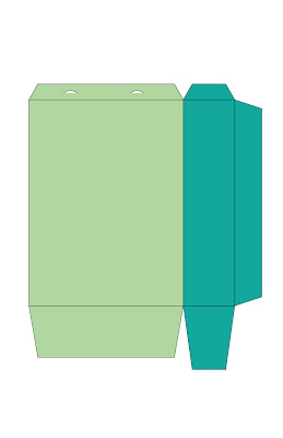
My practice bag outline for class :) I might make a fat bag (horizontal) instead of a vertical one, or both, depending on how easy it actually is to make them.

Monday, October 17, 2011

~Indian Images


For the upcoming project, I chose to
use Indian culture as my inspiration. I
love Indian culture because of it's
rich history, brilliant colors, fashion
and ornate architecture.


I have already complied my 15 images, but here are 3 news ones that I might use
to gather colors or ideas from during
the project. The first is of four women dancing in decorative Saris (their gowns), the next one, of colorful spices, and the last,a beautiful shot of the Taj Mahal and a reflection of it in the water.


I'm not sure whether I'm going to
do chocolate or candy for the project,
so far all I've done is my brainstorming exersize, and have also
begun considering possible color
schemes, typefaces and basic logo
designs for it.

Monday, October 10, 2011

~Symbol design

I learned several things from the symbols project; it was a fun, yet time consuming and a bit difficult.
Throughout the project process, I had to not only sit down with my partner and learn things about her, but also had to figure out a way to represent those aspects in an easy to understand and aesthetically pleasing way.
For the overall look of my symbols, I wanted to do a black and white "clipart" looking style, with choppy lights and darks. At first some of my symbols were a bit sloppy and didn't read right, but after some careful revisions I think I have the look I'm going for.
I think what I learned the most was about how much effort and tweaking of a piece it takes to make sure that it's read/understood universally, ex- it doesn't read as toilet paper to one person, photography to another and making a movie to me. And sometimes that means going back and completely redoing an image, even if you like it as is.

Monday, October 3, 2011

~Color scheme practice exercise


~Hello again! :) I picked this image for my color scheme exercise because beyond the generic (easy to see) colors like the light blue, red and yellow, there are a lot of nice in-between colors that you can make palettes with. I actually did 2 color schemes, one using all green tones on top and one that utilizes the primary tones and some darker variations and blends of those colors.

Monday, September 26, 2011

~Illustrator Redraw Project


Hello again :) So, here's my original picture and illustrator redraw from today's in class assignment~